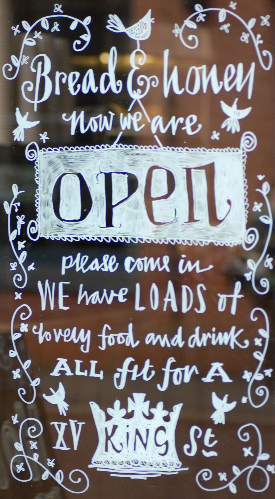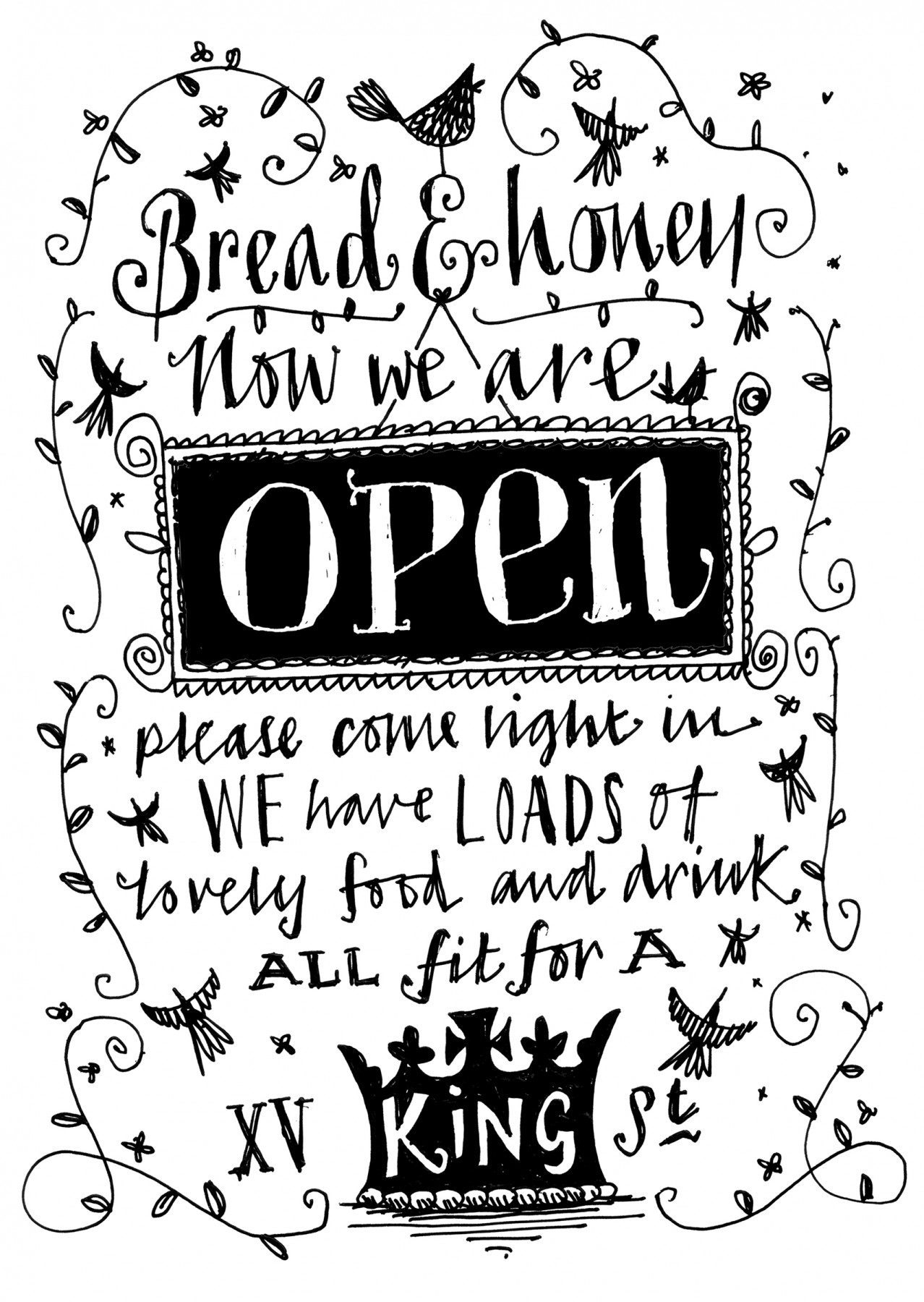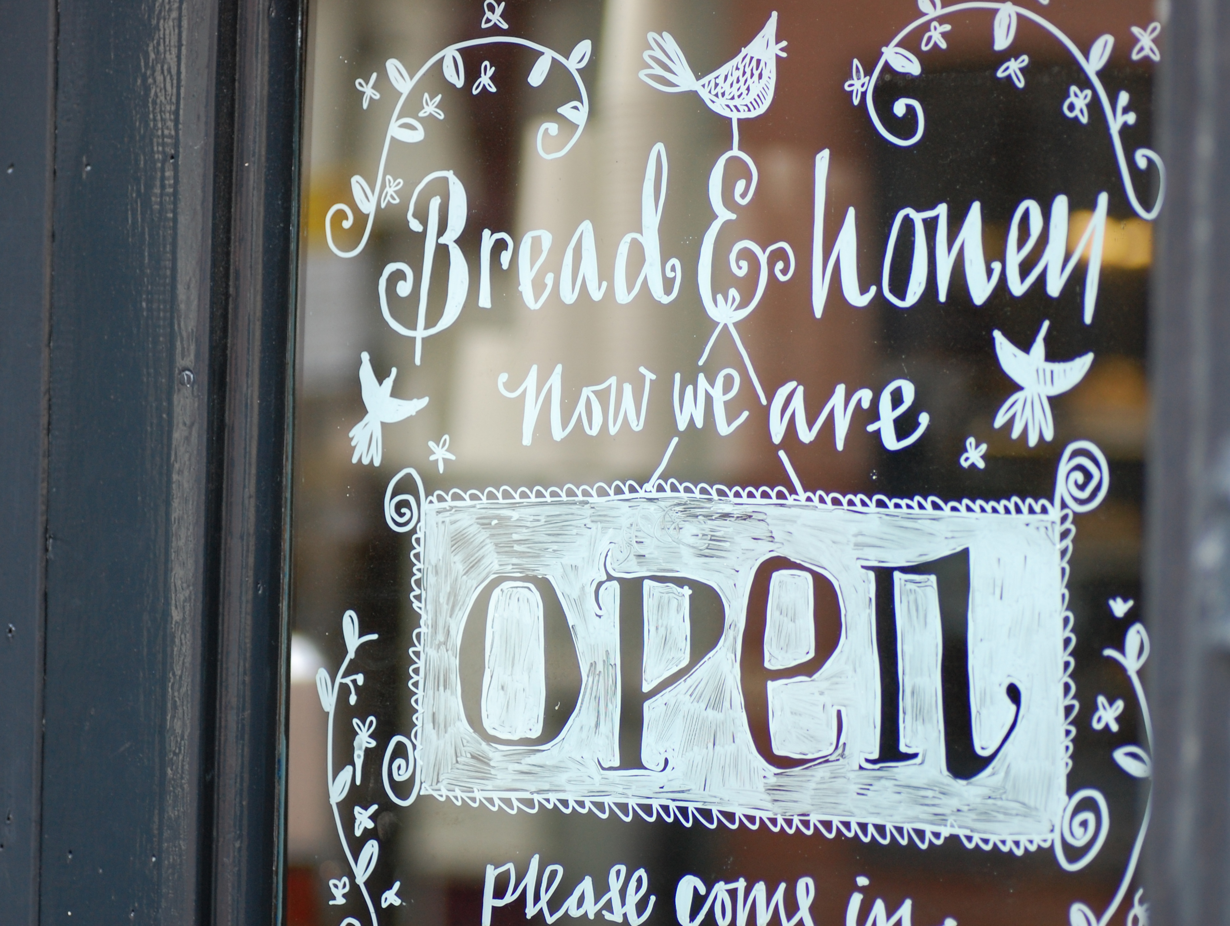
The project involved working closely with the shop’s owner, Paul Draper, to come up with a concept and suitable illustrations. The name ‘Bread & Honey’ evolved from the shop’s location on King Street and the nursery rhyme ‘Four and twenty blackbirds‘ — all fit for a king. To fit the theme we used lots of hand-drawn blackbirds, crowns and typography — some drawn precariously perched on a ladder! The simple black and white colour palette complements the muted colours of the gorgeous Victorian shop interior.
Client: Bread and Honey